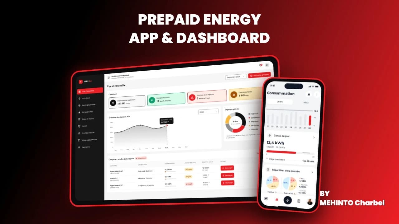
SBEE Pay: prepaid electricity top-up app

Charbel Mehinto
Product Designer UI/UX
The problem
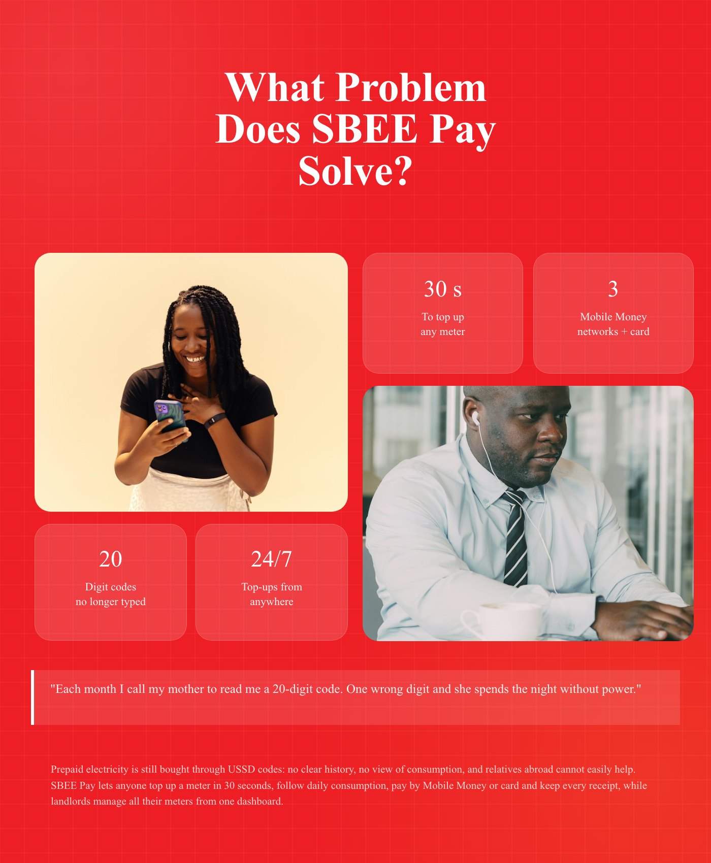
Top-ups rely on hard-to-use USSD codes, with no clear history or consumption view. Members of the diaspora cannot easily help relatives back home.
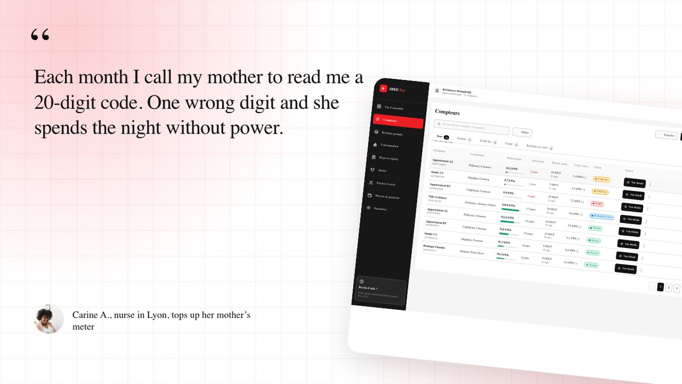
The solution
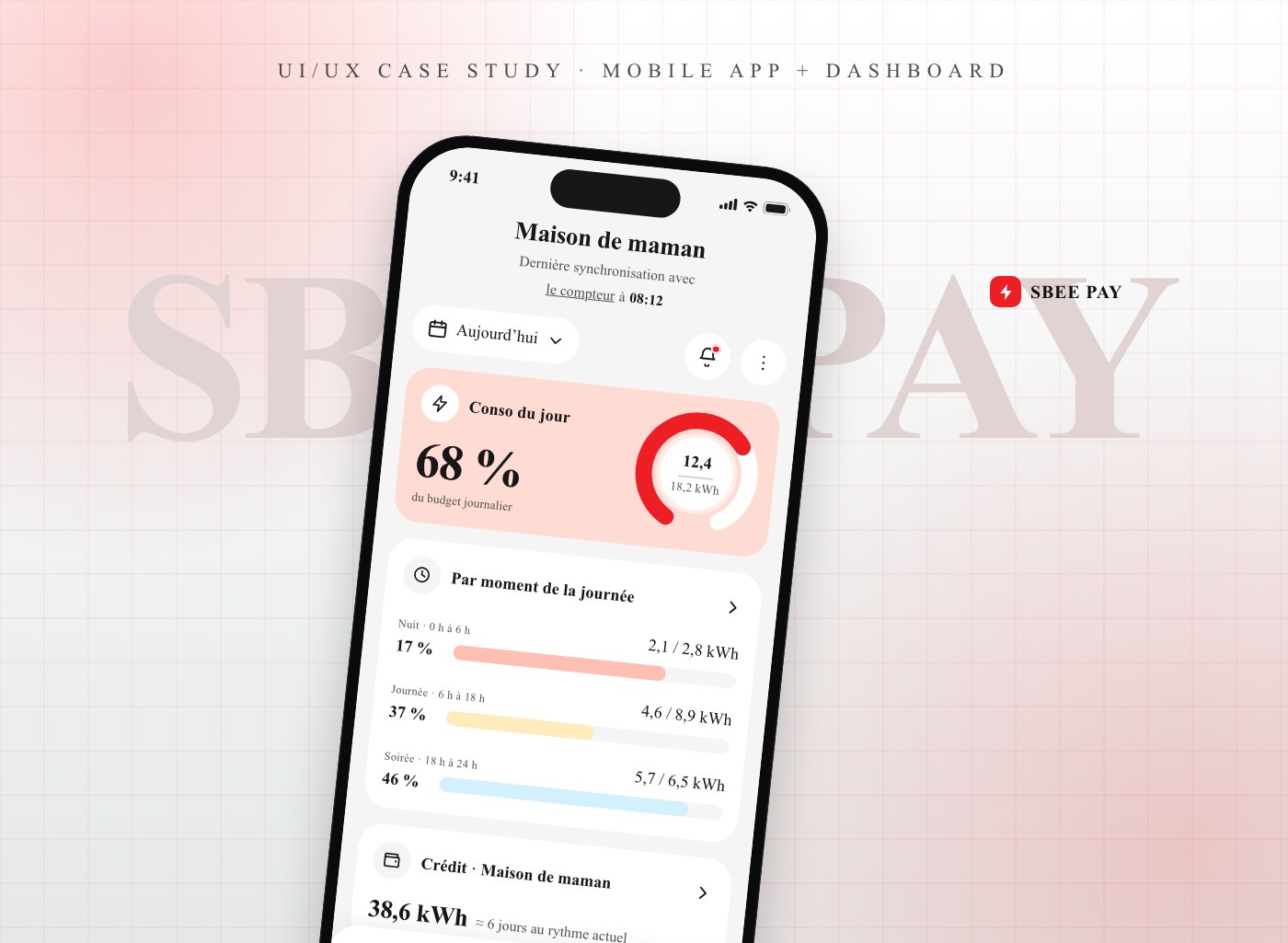
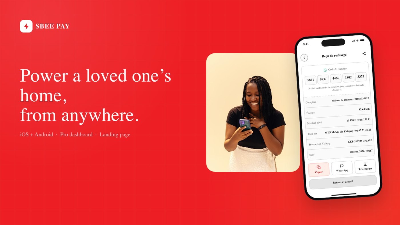
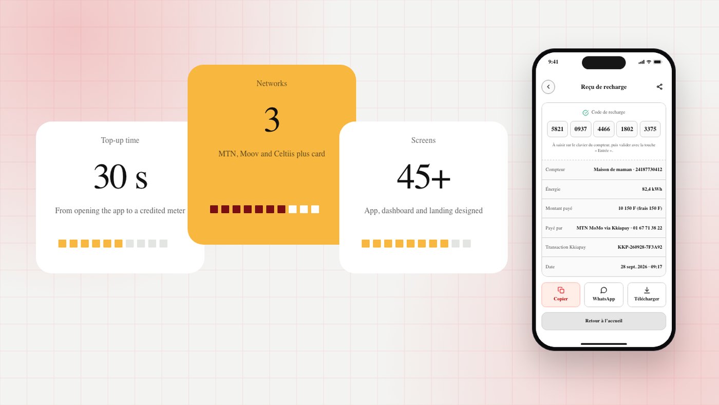
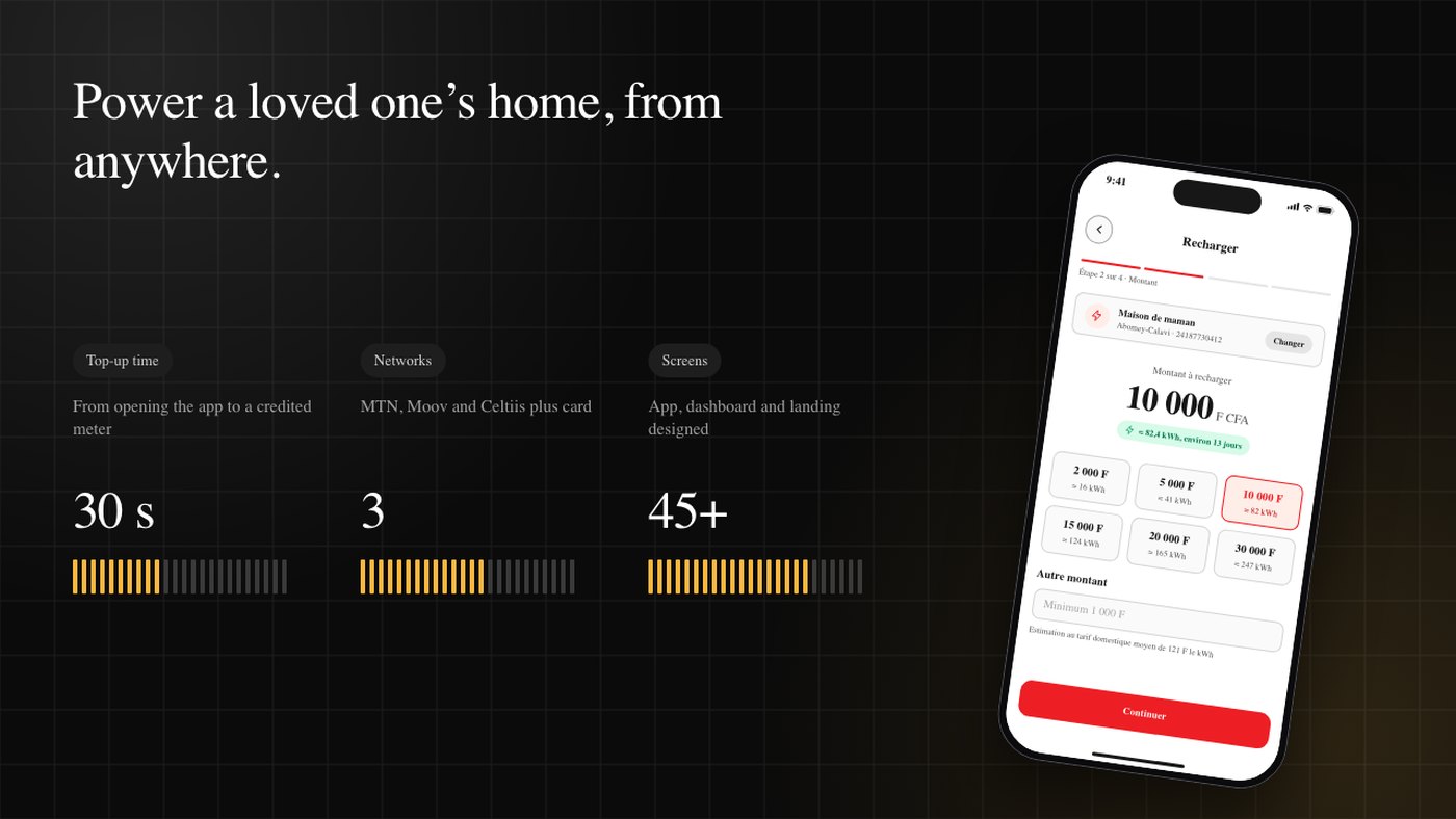
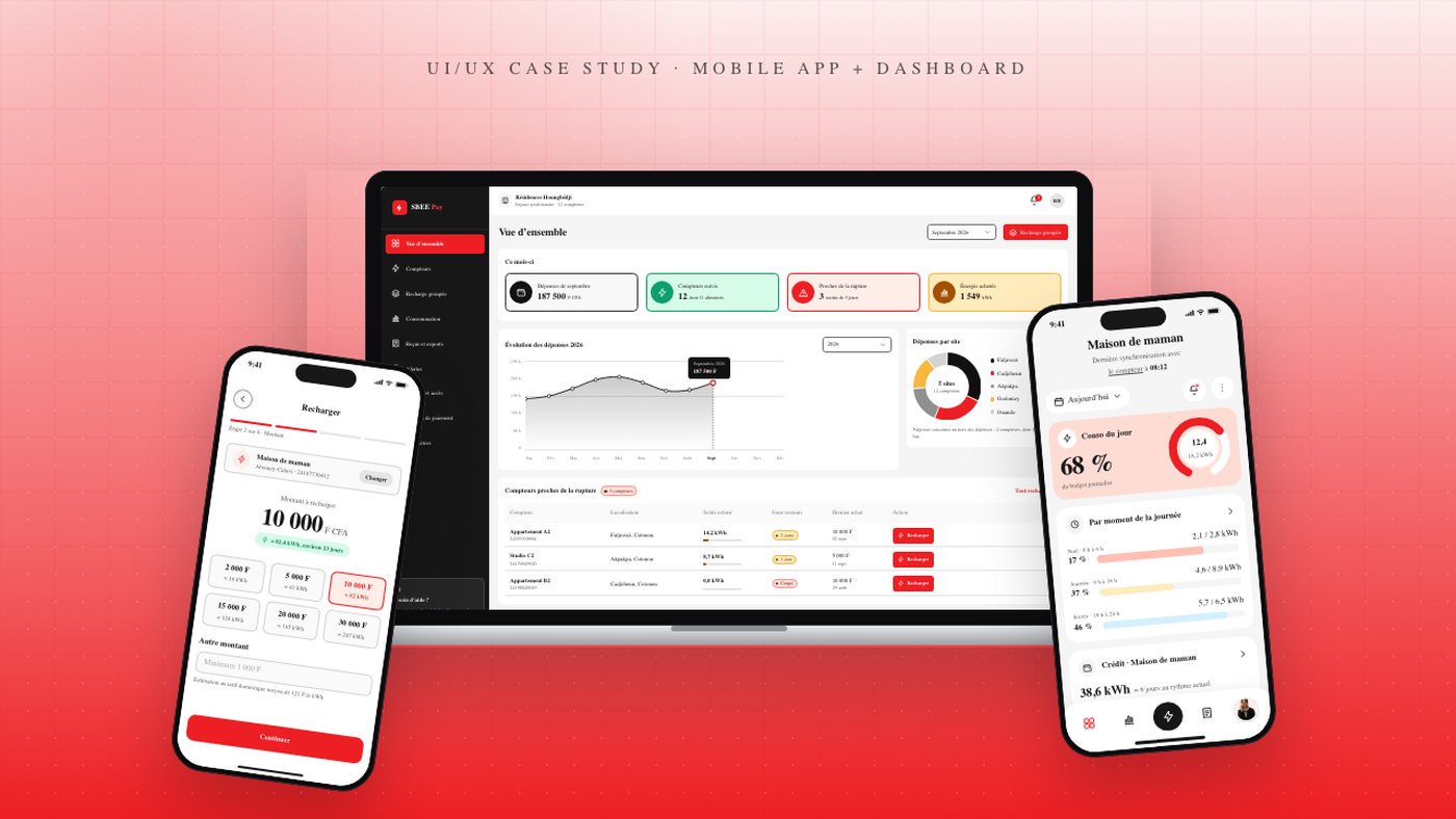
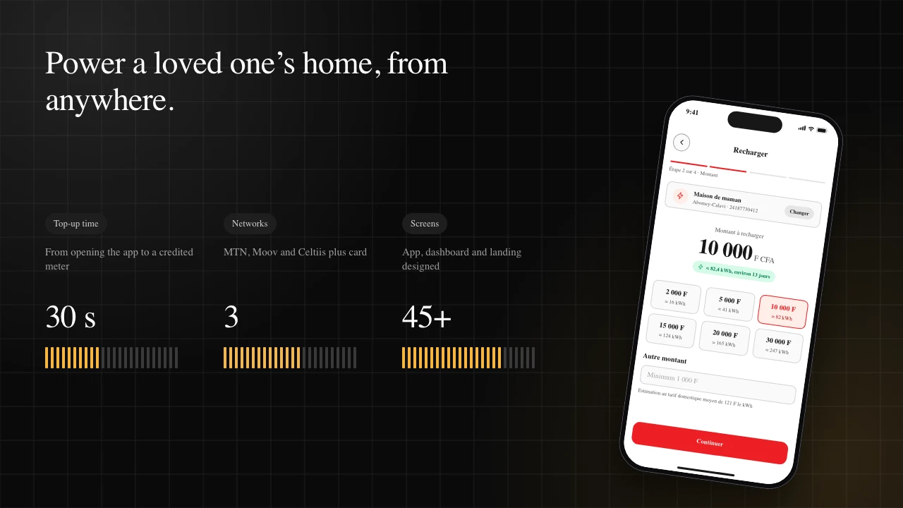
An app that manages several meters, shows daily consumption and lets you top up a relative's meter in 30 seconds, from anywhere.
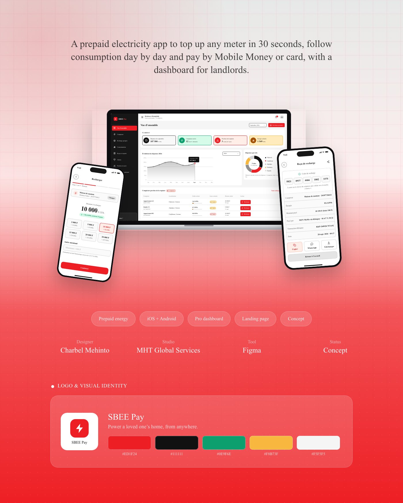
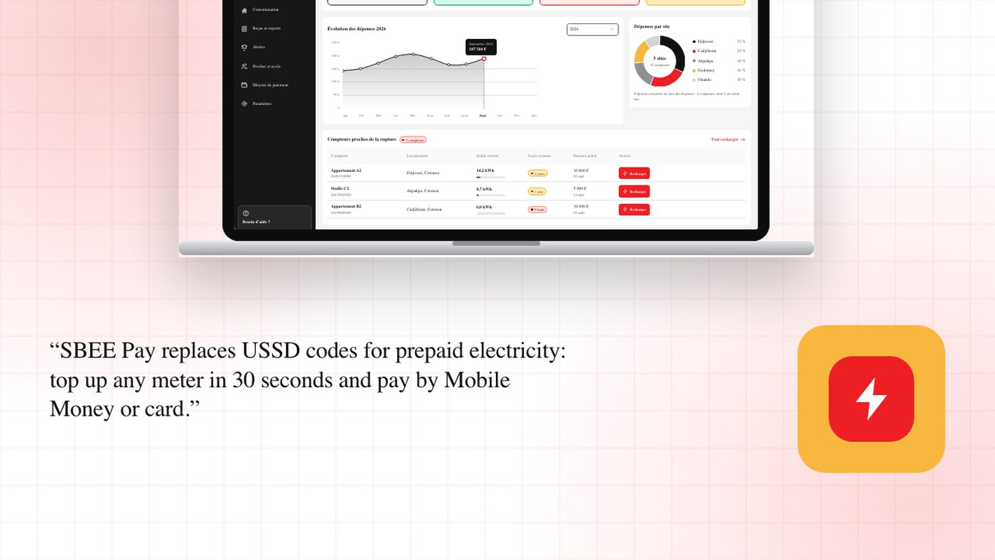
Key features
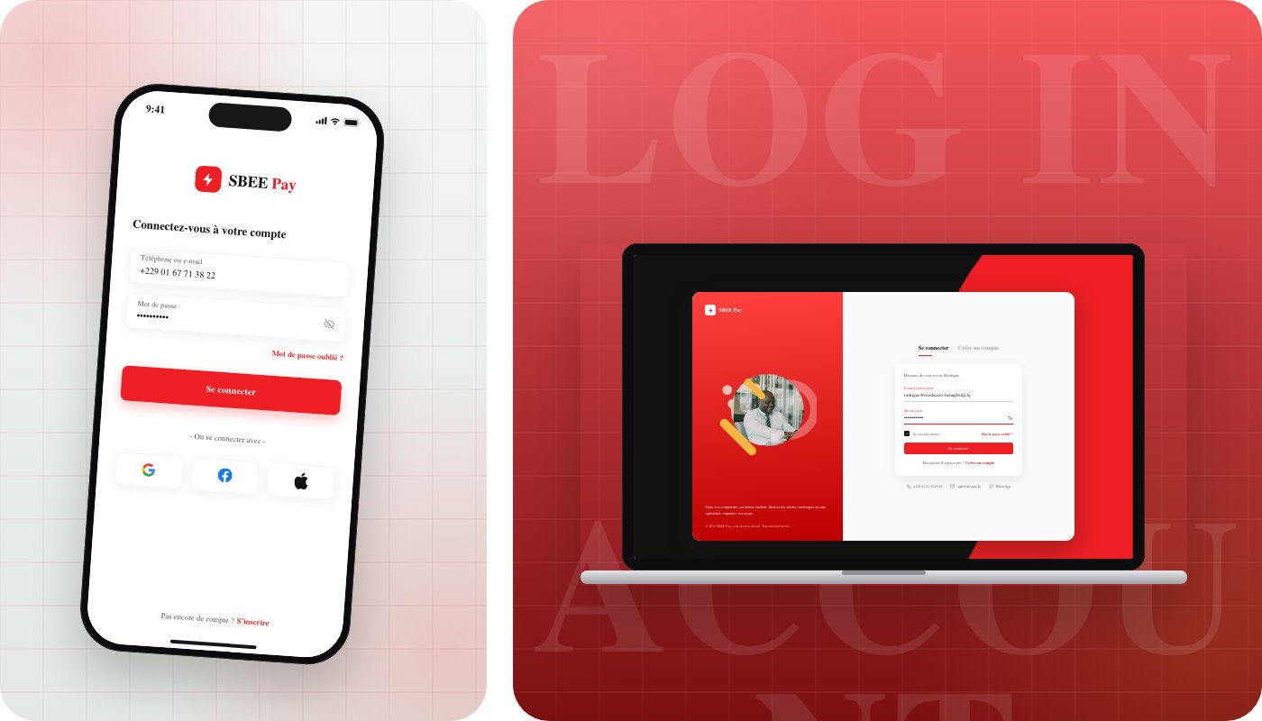
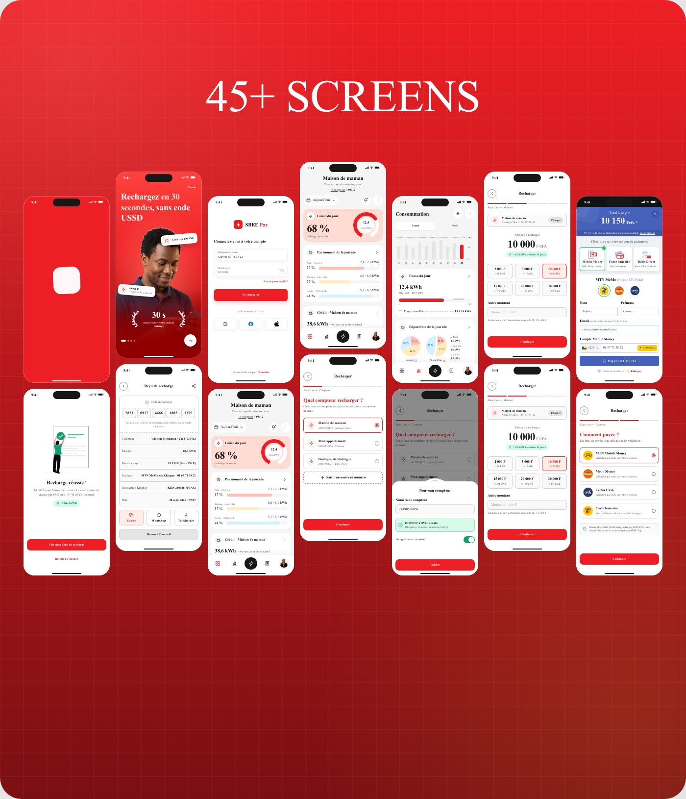
Four-screen illustrated onboarding
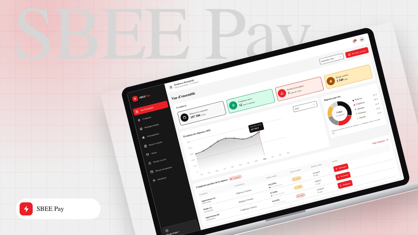
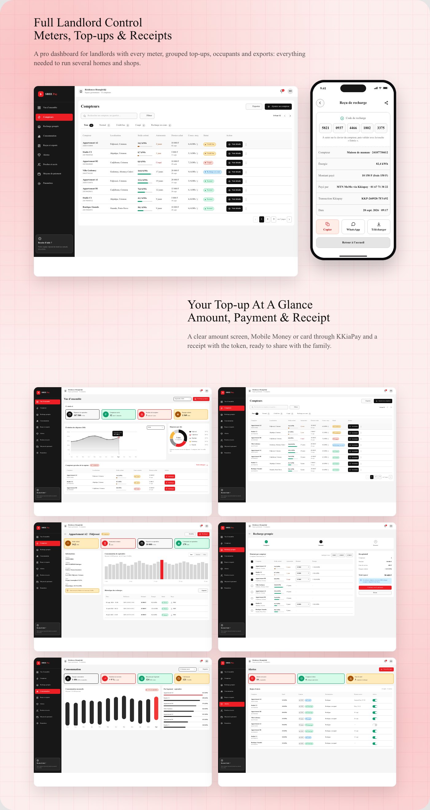
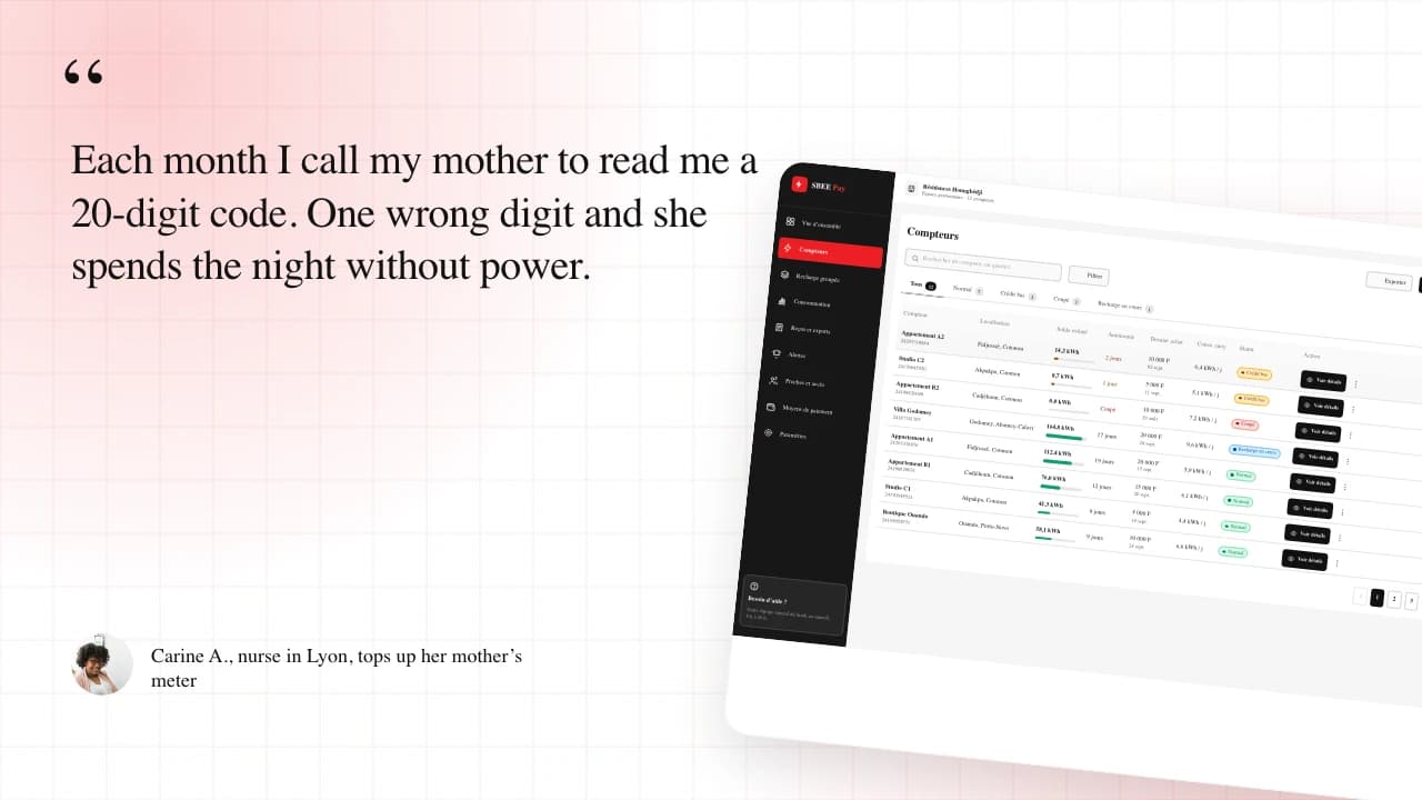
Multi-meter management and consumption tracking
KKiaPay checkout: Mobile Money (MTN, Moov, Celtiis) and card
Top-up history and receipts
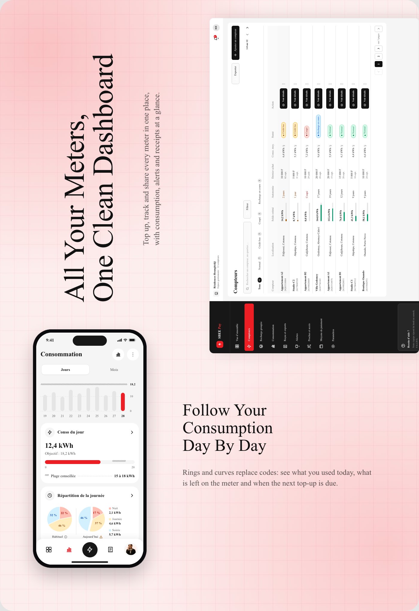
Design process
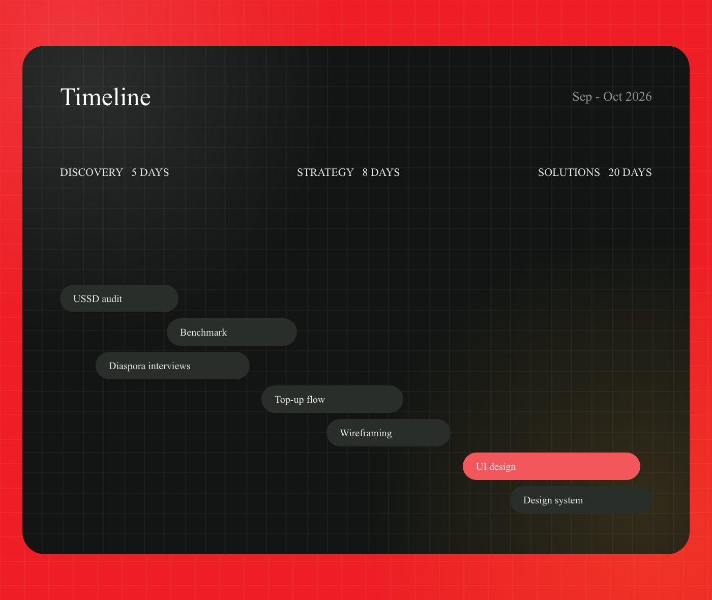
Four phases: discovery (interviews, audit of the current service), definition (user flows, information architecture), design (UI, design system, prototype) and delivery (landing page, specs).
Design choices
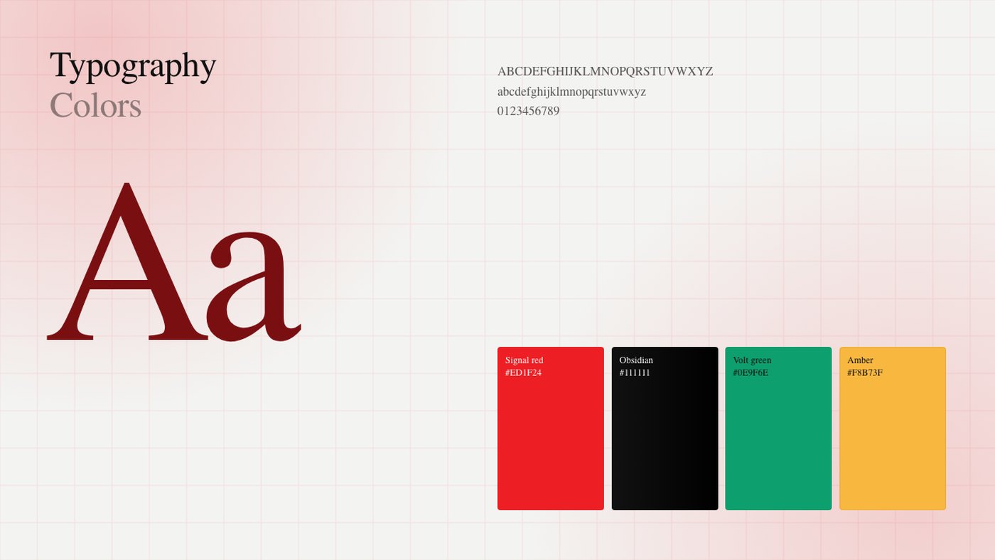
Signal red #ED1F24, taken from the SBEE logo, black #111111 for strong surfaces, green #0E9F6E for successful payments and bordeaux #9B1C1C for errors, always paired with an icon and a label. Montserrat for headings, Inter for body text, and consumption shown as rings and curves instead of codes.
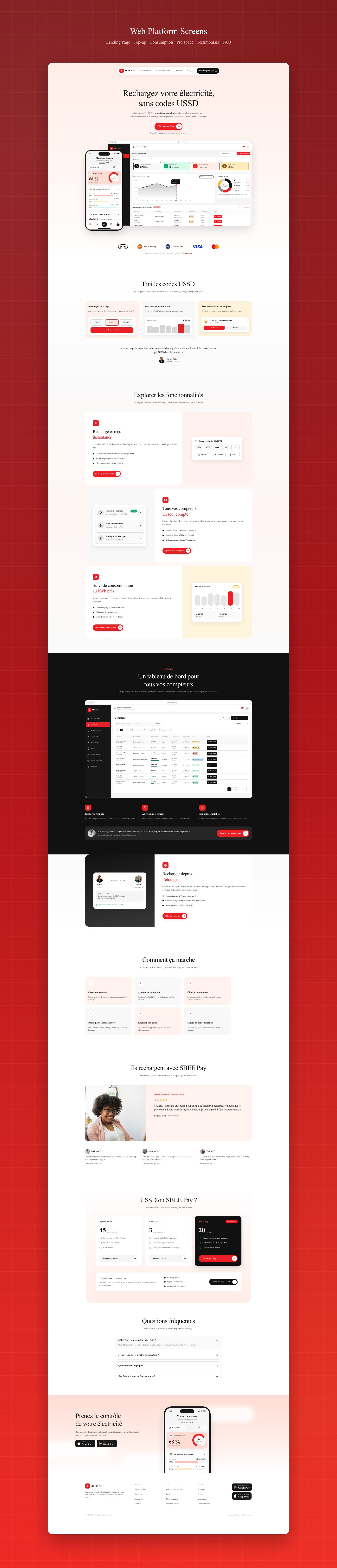
Landing page
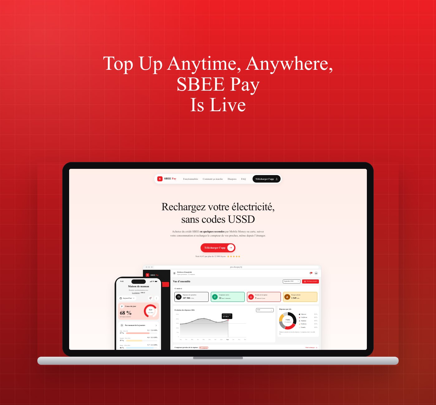
A landing page presents the offer, shows the app and the back-office, and drives downloads.
Deliverables
iOS and Android mobile app
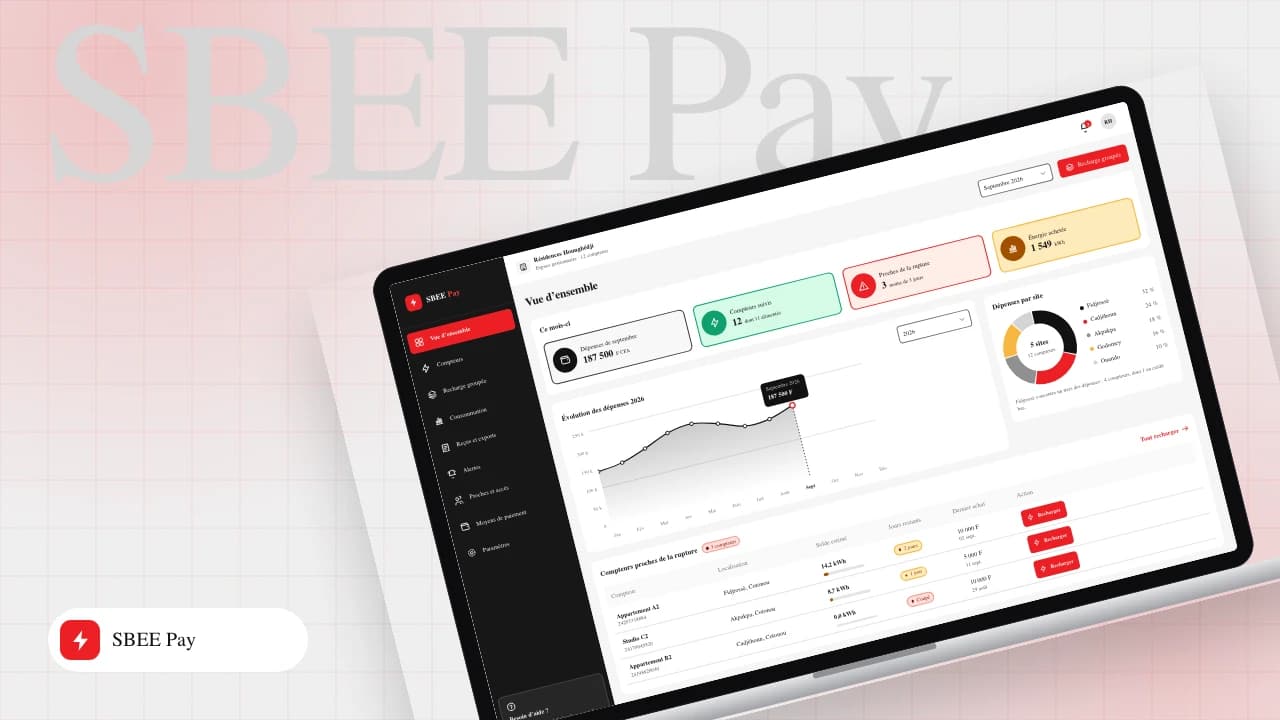
Web dashboard for landlords
Landing page
Design system, Behance presentation and LinkedIn carousel
My role
User research and personas, user flows, information architecture, high-fidelity UI design, design system and interactive prototype in Figma. Screens are produced with a custom TypeScript Figma plugin driven by a UI kit, with accessibility checks: 4.5:1 contrast, 44 px touch targets, errors never conveyed by colour alone.
Unofficial portfolio concept, not commissioned by the organisations mentioned.
Comments (0)
- Be the first to comment.